Sunday


Actors:

We are using Shauna, Simran and Jack as our actors.

We decided to Use Shauna as our only female protagonist in our title sequence, as she has a sweet and innocent look, and looks similar to that of a woman from the 1950's, which is when our title sequence is set. She is also white British, like our Target audience, and therefore historically there would be no prejudice against her and she fits well with our setting - a Piano performance. 

Simran is our femme fatal character, we chose her for this role as her long black hair is typical of this type of character, and her definite features mean her expression is easily noticeable, we have also had previous experience working with her in our continuity task, and know that she would be able to portray this character well through her acting skills. 
Jack is our male cynical antagonist, we chose him for this role as he is white British - like most of our audience, and his sweeping hair creates a level of mystery, which is what will be portrayed in our title sequence.

Brainstorm of ideas for our title sequence

This is a brainstorm of ideas we looked at when deciding what to include in our title sequence:

From looking at this mind map you can gain an insight into the things we looked at when deciding what our final idea would be, in the end we have decided to film inside a cinema, with an assassin themed plot, a knife will be used to kill the female antagonist. It will be set in the 1950's, and be a crime - thriller and film noir title sequence. We will be using Shauna, Jack and Simran as our actors, and i will post casting shots of these later on. We decided on this instead of the other ideas we had because we thought this would be the most realistic and easier thing to portray, for example, the picnic idea was less doable because we will be filming in late February and so it will be too cold for our actors to be filmed outside in the cold in 1950's dresses. 

continuity task 1 - jadepradatiffanyemily


This is our first cut for our continuity task, we had several issues when filming this, as we could not always find a time to film that suited all of us, as well as the room we filmed in being free. We also had trouble with making sure the continuity was correct, as you can see at 0:42, as in the previous shot there was not things in the wall and in this shot there is, however we could not do anything about this as we were filming in a classroom and the teachers had banned us from taking them down.

To improve this, we have been told that we need to:
 include a shot reverse shot(over the shoulder)
include match on action
make sure we do not break the 180 degree rule, as it was broken at 00:00:51
More varied angles need to be used
Improve the framing. In one scene the top of her head was cut off and so was her chin.

Our work into our continuity task will be constantly undergone whilst we work towards our main task, as the difficulties in finding availability have meant that we did not get this task completed in time, and so therefore will be working towards the final cut of our continuity task in our own time.

continuity task - shot list and story line.

For our continuity task we first looked at filming a conversation using the actors we are using for our main peice, however, getting all of them to be free became problematic, so we decided to just film a conversation between Prada (as mum) and Simran (as daughter), the story line to this task was a teenage daughter telling her mother that she was pregnant.

Shot list to follow.

continuity task


We will need to complete a continuity task before we begin filming the real thing, this is so that we have a chance to practice different shots, editing, creating a mice en scene, and thinking about the effect of sound. As this is not something we have done before. This sheet conveys what we will have to do to create this continuity task.

research into women's makeup and costume in the 1950's

This image shows a dress that would have been worn by a classic woman in the 1950's - not a femme fatal character. The picture on the right is a picture found on the internet, whereas the picture on the left is of a similar dress which we have the option of using. Researching this has benefited as we are basing our title sequence in this time period, and costume is a very prevalent part of creating verisimilitude. 


These two dresses were both found on the internet, and convey dresses that a femme fatal character could wear in our film, as a femme fatal is a conventional character seen in a film noir. This research has helped me to think about the outfit worn by Simran - our femme fatal character, as she needs to appear sexy and dominant, which her costume will emphasize.


These two images show research done by Prada into makeup and costume worn by women in the 1950's, as this is when we have decided to base our title sequence, and know that we will have women in our title so therefore this research is important when it comes to giving our title sequence verisimilitude. Prada noticed several consistent factors of this time periods 'look', for example red lipstick was very in fashion at the time. From looking at this and Sin City, we have decided that our film should be film noir, but our femme fatal character will have bright red lips, signalling that she is dangerous, and staying with the time period.

Prada Nayar's work on the history of thrillers.


THURSDAY, 28 NOVEMBER 2013

The History Of The Thriller Genre

I have decided to look further into the history of the thriller genre so my group and I could gain a more advanced comprehension on how the genre has altered through the years. The main reason why the thriller genre tends to change is due the audience becoming less scared as the story line became almost predictable to them. 

Thriller is a genre which is used in several aspects of media such as television, film and literature. Thriller is used in these to create suspense, excitement and tension. The most common use of sub genres to the thriller history are mystery and psychological thrillers. This may be because of the story lines which has been used. Thriller is very similar to the horror genre as both make use of suspense and atmosphere to encourage feelings of dread to their audience as well as intrigue. The genre of thriller developed from popular novels, the novels were then used for ideas which people reproduced into a film. A film is portrayed as a thriller when the plot gives the audience a thrill and keeps them on the 'edge of their seats' as the plot builds up towards the climax. The tension is usually built up by a character being placed in a threatening situation, a mystery or a trap which seems impossible to escape. There is also use of life threatened during a thriller film, as the main character is usually unsuspectingly or unknowingly involved in an extremely dangerous situation.

Example of a 1930's thriller film.


Here is example of a 1980's thriller.


An more recent example of a thriller 2013.             


After having looked at all three of these trailers it is clearly evident how the thriller genre has evolved. One major change in the thrillers is that when it goes on, it gets more dark and scary as the audiences expectations are raised. The first film which was made in 1930 would arguably not come under the thriller genre if it was made today as people would not be on find it thrilling due to fast change over time, so this arguably goes against the conventions of what a thriller needs to make an audience feel. The second one improves, as you can tell it is very stereotypical due to the violence and weaponry but still I do not think it would create sufficient suspense of tension required for a modern audience. However, the last example: Gravity, would be in the thriller section as when watching the trailer it built up tension and intrigues the audience leaving them wanting to know what is happening in more depth, along with the sound camera angles mise-en-scene etc.

From looking at Prada's work i have learnt how thrillers have evolved over time, and what has changed. Looking at this helps us to incorporate new ideas when it comes to a thriller into a film based in the 1950's.

questionnaire

Please fill in this questionnaire and help us to produce an excellent title sequence for our AS level coursework, thank you -

http://www.surveymonkey.com/s/VPH7GKZ

Research into age ratings - by Prada


BBFC

The BBFC are abbreviated for the British Board Of Film Classification. It is a non-governmental organisation and is funded by the film industry. The BBFC decide the certificate of age rating a film should attain. This is an extremely important stage and initially enforced due to children of young ages being exposed to inappropriate content and further imitating it.

What is allowed in a 15 rated film?

The specification is divided into sub categories: Sex, Horror, Nudity, Language, Discrimination Imitable Behavior, Drugs and Violence. This does not necessarily mean that in 15 rated films these categories are accepted, there are still restriction to a certain extent. For example, drug taking may be shown but the work as a whole must not promote or encourage drug misuse. This mean that the use of drugs is allowed to be shown, however the full use of them is not due to it being seen as promoting to audiences. An additional example is the exposure of sexual violence. Detailed verbal references to sexual violence but any portrayal of it must be discreet and have a strong contextual justification. This means that the topic can be spoken about or referred too in detail however cannot be physically show.

What is allowed in an 18 rated film?

There are no actual limits in an 18 rated film. Almost anything is allowed, just as long as it isn't too disturbing that it could potentially cause the film to be banned. In the past, violence was one the most problematic aspects when passing a film with an 18 certificate, whether it is sexuality or fantasized violence. Horror films were often the culprits for the portraying graphic violence and this often results in a lot of grief to audiences. This means such scenes must be removed before giving it a certificate.


Is there a difference between a 15 and 18?

The answer is yes, depending on what the film contains and presents. Some films may be scraped and argued into a 15 as it all depends on the contents and the effects that may have.

- From Prada's research i have learnt the differences between a 15 rating and an 18 rating, we have not included information about the 12 rating here because we were already certain that we did not want to do this. From this information we concluded that we wanted to create a title sequence for 15 year old's and up, as this would be a lot easier than creating an 18 as this would mean having to include content that we are not considered old enough to view.

Thursday

Research into the modern noir


Modern noir - (Neo-Noir = New black)


From this research I have learnt the differences between classic film noir and neo noir; as neo noir is aware of modern technology and circumstances, our group has decided to use classic film noir, as we are setting our title sequence in the 1950's.

Emily Hardy and Tiffany Leung's research into classic film noir

Film Noir: Codes and Conventions

They use certain shots to make the viewwe feel uncomfotable and to create tension:
-high and low angled shots
-extreme close ups
-refelctions obscured through objects
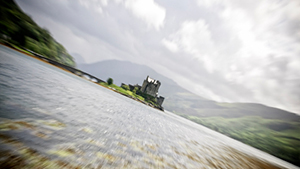
-dutch tilts:

Dutch Tilt Shot  This was used a lot in German films of the 1930s and 1940s.
They use everyday locations to make whats happening seem more real. Normally in dodgy areas to normal locations:
-often rainy on damp streets
-low key lighting
-high contrast (dark blacks and whites)
-urban locations

The sound used reflects the sense of foreboding in the films:
-downbeat jazz music
-heavy breathing
-quiet and silence
-discordant/grating music
-sudden noises
-voice over of protagonist

Editing follows many traditional crime characteristics:
-non linear at the start then tells the story in flashbacks
-generally use continuty editing
-jump cuts


It is important we know all of this as we then know what kind of things we need to included in our film to make sure it follows the typical conventions of a film noir. We will have to include some of these things for it to work effectively. 


Film Noir - By Tiffany Leung


As a group we have decided to base our film black and white (film noir).

Film Noir of this era is associated with a low key. Black and white visual style. A cinematic term used to describe stylish Hollywood crime dramas.
The 'dark' downbeat and back the looks and themes were of many American crime and detective films released in France to theaters following the war.

Examples of Film Noir:

  • The Maltese Falcon (1941)
  • Murder, My Sweet (1944)
  • Double Indemnity (1944)
Film Noir s not a genre, but rather a mood, style, point of view or tone of a film. It's helpful to realize that 'Film Noir' usually refers to a distinct historical period of film history. 
Film Noir films (mostly shot in gloom grays, blacks and whites)
Thematically showed the dark and unhuman side of human and nature. It emphasizes the brutal, unhealthy, seamy, shadowy, dark and sadistic sides of the human experience.

Primary characteristics and conventions of film noir:

Classic Film Noir were: Alienation, Disillusionment, Pessimism, ambiguity, evil, desperation and paranoia. Story lines were often elliptical, non-linear and twisting. Narratives were frequently complex, maze-like and convoluted and typically told with foreboding background music and flashbacks.

Females in Film Noir, 2 types:

(1)- Dutiful, reliable, trustworthy and loving women

(2)- (Female Fatales)- Mysterious, Duplicitous, Gorgeous, Unloving, tough-sweet, unreliable and desperate women.

The male protagonists in film noir wished to elude his mysterious past, and had to choose what path to choose and what to take.


The first detective film to us shadowy, nihilistic noir style was The Maltese Falcon. the film used low key lighting and inventive and arresting angles. unusual camera angles- sometimes low to the ground, revealing ceilings of the room- are utilized to emphasize the nature of the characters and their actions.


This research carried out by Emily on some of the codes and conventions of film noir provides us with a brief insight on typical aspects such as editing and camera angles to consider within our title sequence. We have discussed these various features and have decided to include the various camera angles to increase tension a main emotion we intend to provoke out of our audience.in order to become familiar with these shots a two of our group members have dedicated time practicing these which will ultimately be beneficial when filming the real thing. 

Among some other research we conducted as group we came accross a particular aspect of editing we considered suited to our film noir theme. This was an entire scene in black and white, however the main antagonist in a bright red dress. We were quite fond of this idea and plan to do it in our piece. Although instead of the red dress we will have our male antagonist in a red tie. We chose to alter this due to it being common in a few films we have seen, therefore thought to add our own modern twist to it. The reason for a red item of clothing, standing out amongst the uniform black and white is to signal a sense of danger to audiences hinting Thor character to be bad.

From their work I've learnt about The classic film noir, and the codes and conventions that come with it, this is useful because we intend to create a film noir title sequence and so will have to include some of these in our work .


Typography in thrillers - Tiffany's work


The typography used is a San-serif font, the writing is in white on a black background, this makes the letters appear more striking and bold. The colours used fits in with the film, as the film is 'film noir' based. Meaning the film is shot in black and white. The text has a large font in capital letters, this makes the title bold and stand out from the background. Through the middle of the title it has been sliced apart, this fits in with a thriller film as it shows that their is going to be something wrong happening in film as the letters are 'broken' apart. The colour white signifies innocence, youth, peace and purity however black signifies death, evil, fear, anger and mystery, the two opposite colour may signify the different characters in the film, which makes it evil and spooky.


The typography used is in San-serif font, in red. The title really stands out to the rest of it, the background has shades of greys and blacks but the the red writing stands out the most, it is very striking and bold to the rest of it. The title is in capital letters with very spaced out letters, I think it makes it more unique. the colour red signifies aggression, danger, blood, death and war which connotes that it is a thriller film.


The typography used is in Serif font, it is usually associated with women more than men this is because it makes it look more feminine, however the black font makes it look dark, the title is very small on the side of the cover this makes it look more evil and mysterious. Also there isn't much to the cover, it is on a white background with black writing this signifies there is too sides to the film.


The typography used is in San-Serif font, the title is bold but not too big, the white title really contrasts well onto the dark background, it makes it look bold and stand out. The title is in capital letters and are spaced out this is because the font size isn't too big still making the the title stand out.


By looking through typography in thriller films, I have learnt the themes and characteristics they use. I can see that majority of the thrillers I have researched use darker colours and san-serif font, this tells me that they want to create a bold, dark masculine effect rather than a sweet, innocent feminine look. Thrillers also like to use opposite colours, like white and black, this is because it has a nice contrast between the colours and represents the characters in the film (good and evil).

- From Tiffany's work i have learnt about the different types of typography used in Thrillers, which will help us to create our title sequence in that we will use typography over the top of our film to convey the credits, which is what is expected of a title sequence.

Wednesday

Research into the thriller genre


From researching this I have learnt the sub genres of Thrillers, from looking at this research my group have decided to create a title sequence for a crime thriller because we feel that this would be a dramatic sub genre to portray. Since we have already decided to create a film noir title sequence we think a crime thriller fits very well.

Sin city title sequence analysis

From this analysis I have learnt about using colour to convey significance, for example the woman who died wears a red dress, we are going to use this technique in our own title sequence.

Hostage title sequence analysis

From this I learnt about animated title sequences, and how these can be used to create a intriguing effect, I don't however think I will be using this technique in my own title sequence, but analysing this one has helped me to decide this.

Walk on the Wilde side analysis

From this I learnt about film noir - which is our chosen style of film, and how shadow and music can create tension and excitement.

Tuesday

Title sequence analysis - Saul Bass: Prada Nayars work

This is a member of my groups work, from her analysis of Saul Bass I can conclude that Bass used the storyline to create the title sequence, to give a innovative and attention grabbing title sequence. This is something we will put into place in are own work, as I think it makes the opening sequence more powerful and interesting, so therefore it will seem as if there is a real film to be watched after our title sequence:Saul Bass was an American graphic designer and Academy Award winning film maker, best known for his design of motion picture title sequences and film posters.

During his 40- year career Bass worked for some of Hollywood's most prominent filmmakers, including Alfred Hitchcock, Billy Wilder and Martin Scorsese. 

Bass became widely known in the film industry after creating the title sequence for Otto Premminger's The man with the golden arm (1955). The subject of the film was a jazz musician's struggle to overcome his heroin addiction, a taboo subject in the mid-1950s. Bass decided to create an innovative title sequence to match the film's controversial subject. He chose the arm as the central image, as it is a strong image relating to heroin addiction. The titles featured an animated, white on black paper cut-out arm of a heroin addict. As he hoped, it caused quite a sensation.


For Alfred Hitchcock, Bass provided effective, memorable title sequences, inventing a new type of kinetic typography, for North by Northwest (1959), Vertigo (1958), and Physco (1960). It was this kind of innovative, revolutionary work that made Bass a revered graphic designer. Before the advent of Bass’s title sequences in the 1950s, titles were generally static, separate from the movie, and it was common for them to be projected onto the cinema curtains, the curtains only being raised right before the first scene of the movie.

“For the average audience, the credits tell them there’s only three minutes left to eat popcorn. I take this ‘dead’ period and try to do more than simply get rid of names that film goers aren't interested in. 
I aim to set up the audience for what’s coming; 
make them expectant.”
— SAUL BASS                                

Analysis of Anatomy of a murder - Emily Hardy

This is a member of my groups analysis of anatomy of a murder, from this I have continued to learn about film techniques, and have gathered suggestions which we could use in our own title sequence:

The opening of the film uses cartoonised body and uses close ups on differents parts off it. This is not very graphic and its quite simplistic which gives the impression that the film isn't going to be extremely violent even though it is about murder. We get an impression that it could possibly be quite light hearted. Also using the body it makes it clear that the film is going to be about people being killed as we are shown all the body parts seperatly. This clearly links in to the title. The font they use is a white sans-serif font. This makes it quite informal which links into the sense that the film could be lighthearted. Using white subverts our expectations. White connotes to innocence and purity which is not something that is at all related to murder. However, it is written on a black/grey background which relates more to murder as black can connotes to death and danger. The music used is quite upbeat which is contrapuntal. It yet again subverts our expectations of a film about murder, it is quite disturbing that the music is so happy when the film is going to be about people getting murdered.

Analysis of Se7en - Emily Hardys work

This is a member of my groups analysis of Se7en, from it I have learnt about what is common in thrillers and some techniques we could use in our own:


The establishing shot of the film is a close up on the pages of a book. This suggests it will be quite a significant item in the film as it is an image used constantly throughout the opening. Also throughout the opening they use quite a few close ups on the hands which suggests they are also quite important. They are busy doing things and they grate off their own fingertips which adds a sinister mood to the film almost immediatly. The music used goes really highpitched at some parts of the opening. This adds to the tension which is being built by the sinister images being shown. It is quite jumpy which adds to the impression that this film is going to be scary. It is parallel sound, we would expect this music to be used in a horror film. Lots of sharp silver objects are shown throughout the opening like the sissors and the needle. This adds a sense of danger and helps to build the tension, also the impliments are very clean which could show that they are well looked after or that they are new either way they are going to do their job properly and professionally. Just like in Anatomy of a Murder they use white font on a black background. The white stands out on the black which juxtaposes, it gives the impression that innocence doesn't belong in the film and that purity isn't going to be shown. This emphasises the horror genre of the film.