The typography used is a San-serif font, the writing is in white on a black background, this makes the letters appear more striking and bold. The colours used fits in with the film, as the film is 'film noir' based. Meaning the film is shot in black and white. The text has a large font in capital letters, this makes the title bold and stand out from the background. Through the middle of the title it has been sliced apart, this fits in with a thriller film as it shows that their is going to be something wrong happening in film as the letters are 'broken' apart. The colour white signifies innocence, youth, peace and purity however black signifies death, evil, fear, anger and mystery, the two opposite colour may signify the different characters in the film, which makes it evil and spooky.
The typography used is in San-serif font, in red. The title really stands out to the rest of it, the background has shades of greys and blacks but the the red writing stands out the most, it is very striking and bold to the rest of it. The title is in capital letters with very spaced out letters, I think it makes it more unique. the colour red signifies aggression, danger, blood, death and war which connotes that it is a thriller film.
The typography used is in Serif font, it is usually associated with women more than men this is because it makes it look more feminine, however the black font makes it look dark, the title is very small on the side of the cover this makes it look more evil and mysterious. Also there isn't much to the cover, it is on a white background with black writing this signifies there is too sides to the film.
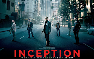
The typography used is in San-Serif font, the title is bold but not too big, the white title really contrasts well onto the dark background, it makes it look bold and stand out. The title is in capital letters and are spaced out this is because the font size isn't too big still making the the title stand out.
By looking through typography in thriller films, I have learnt the themes and characteristics they use. I can see that majority of the thrillers I have researched use darker colours and san-serif font, this tells me that they want to create a bold, dark masculine effect rather than a sweet, innocent feminine look. Thrillers also like to use opposite colours, like white and black, this is because it has a nice contrast between the colours and represents the characters in the film (good and evil).
- From Tiffany's work i have learnt about the different types of typography used in Thrillers, which will help us to create our title sequence in that we will use typography over the top of our film to convey the credits, which is what is expected of a title sequence.


No comments:
Post a Comment